Last week, we had the pleasure of attending the MnSearch Summit in downtown Minneapolis, and we walked away with quite a bit to share. Great speakers like Rand Fishkin, Adria Saracino, Oli Gardner and Lee Odden brought major knowledge about how to stand out in the increasingly crowded field of search marketing. This was the inaugural event, but with material this good and about 300 attendees, look for the MnSearch Summit to become one of the hottest regional micro-conferences around.
Unbounce co-founder and creative director Oli Gardner cares about your conversion rates. A lot. Sometimes, he admits, his care escalates to a “socially dangerous kind of level” where he even considered changing his name to Landing Page. While that would carry all kinds of cred at conferences like #MNsummit, Oli recognized that was the only place his web-savvy moniker would be seen as normal.
“Can you imagine going to a party with no marketers and trying to explain that decision?”
No. We can’t. But being search marketers ourselves, we at AIMCLEAR completely share Oli’s obsession with landing pages that convert.
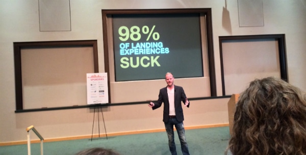
“98 percent of landing pages suck.”
For Gardner, who boasts having seen more of them than anyone on the planet, the problem with landing pages is that marketers are too concerned with getting the click when they should be focused on creating the experience. Customers want to be delighted, he says, and a delightful search experience is one that takes them seamlessly from their SERP to your KPI. For landing pages that don’t deliver a bubbling fountain of delight, Gardner warns:
“If you don’t have a delightful experience during the marketing process, you’re not going to get those customers.”
Conversion-Centered Design
How do we delight and optimize conversion? Forget about the color of your button. Short form, long form; above or below the fold. These aren’t the things that create delight. Conversion-centered design – focusing every element of your landing page on the conversion – is what Gardner says separates the landing pages that suck from the landing pages that rock.
Gardner identifies a set of seven proven design patterns that increase conversions.
1. Attention ratio
A successful landing page gives the user a yes/no question. Strip away everything else that could distract their attention and you will have the 1:1 attention ratio Gardner recommends. As the attention ratio goes down, conversion rates go up. In his work, he’s seen a 31 percent increase in conversions by taking a 9:1 attention ratio, with the nine being he number of things the user could do and the one being what you want them to do, down to the perfect 1:1 ratio. Overloading users gives them an analysis paralysis that costs you conversions.
But what if your campaign requires more than one KPI? To maintain that 1:1 attention ratio, you may want to consider separate landing pages that feature one action per page.
2. Conversion context
A great landing page complements a search query. By matching the style and context of the search conversation that led people to your page, you “respect the search request” and create a strong scent that lures potential customers, giving them a seamless pre-click and post-click experience.
3. Clarity
Users clicking through from search traffic are impatient. To get the conversion, you have to combine your 1:1 attention ratio with focused design. Here, Gardner emphasizes keeping the design area around your CTA free of anything that could cause a user to hesitate. Avoid using scary words like “spam” that mean well in a sentence like, “We will never sell or spam your email” but introduce a fear factor into a user’s mind right at their most vulnerable moment. What?!? Spam?!? Back button now!!!
4. Congruence
Gardner advocates scoring all the elements in your landing page on a scale of 0-2 with zero having nothing to do with your campaign and 2 having everything to do with it. If something scores a one, improve it. If something scores a zero, get rid of it. “Silence is better than bull—-.” Scoring your elements will help you learn how aligned your campaign message is and how you can improve it.
5. Credibility
Congruence leads directly into credibility. If someone doesn’t trust you, that’s another reason they will stop short of your CTA. Gardner suggests leveraging authentic trust signals, transparency and verifiable social commentary to increase conversions. If you can, demonstrate a Twitter conversation that signals real people have done what you want your newest potential customer to do. If you can add video, even better.
6. Understanding motivation
What is the number one question asked during webinars? Will the recording be available afterwards? Know what people want most and put it in your landing page.
7. Continuance
“People like to be led,” Gardner says. “Tell them what to do.” Designing experiences that leverage the post-conversion opportunities extend the life of your campaign and get more out of your investment. Use social proof to your advantage by showing how many times other users shared your offer, how many people signed up for your webinar or how many people downloaded your white paper. If you’ve used congruence and credibility to your advantage, you can seal the deal right here.
Wrapping it all up
Your homepage simply isn’t built for campaign traffic, Gardner emphasizes. Homepages talk about yourself, not how you can solve a user’s problem. By focusing on conversion-centered design that delivers delightful experiences, your ads will stand out from the 98 percent of landing pages that suck and you will get exceptional results.
Thanks for a great session on landing page optimization, Oli! We’ll be back with more coverage from the MnSearch Summit, so stay tuned.
© damicoangie – Fotolia

