What encourages people to share? SMX Social has been full of fantastic tactical advice for how to create great social content that will engage users, but today’s morning session on Designing for Social Media Sharing emphasized the technical ways creators can prompt sharing once their content is created.
Marianne Sweeny, a Senior User Experience and Information Architect with Portent told the audience gathered in day two’s second session the five things social marketers (that’s us!) should know about user experience (UX) as they package and publish their content:
- UX is more than interfaces. At its highest function, user experience is about influencing user behavior.
- UX touches your product (or in this case, your content) and the user
- The consumer experience is going to happen whether you design for it or not, but if you design for it, it’s going to be a lot better.
- UX relies on an intense amount of research using multiple methods and applications. It is not a go with your gut exercise.
- UX will eventually subsume digital marketing. In other words, they’re on their way to being one and the same.
The power of user experience to promote sharing becomes clear when marketers pair this understanding with what they know about the landscape of social media.
People will follow and engage with a brand if the brand gives them a reason to. They want to learn what a brand does and feel more connected to it when the brand engages or rewards them with advance notification of a product or promotion. Give them a good user experience and they’re more likely to join, follow, like and share.
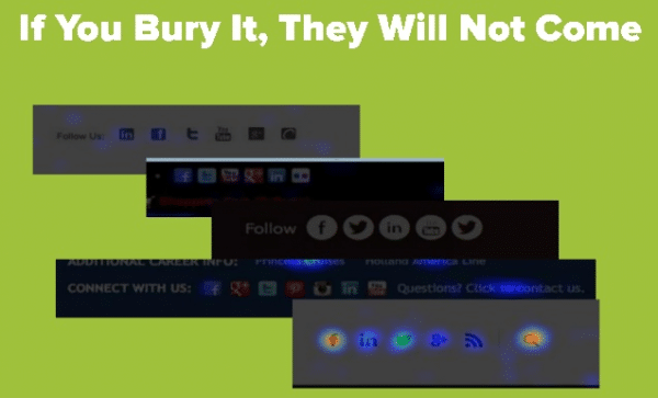
To do that, Sweeny illustrated how not to present social icons on your webpage. “If you bury it, they will not come.” Social buttons get the most activity when they’re at the top of a webpage near the search box, not relegated to the footer, which is the worst real estate on the web.
When a user does want to share, don’t make them work too hard. A pre-populated tweet will make it as easy as possible for them to put your content in front of their friends. Don’t worry, hyper-engaged users will still modify it if they want to.
No matter how you design your site, Sweeny impressed one lasting message on the audience: No dead ends! Every important piece of content on your site should have a related links component to take a user somewhere else where they can find more of what they want. “Always give people their next step, or their next step will be to leave your site.” That’s the last thing any of us want!
The nuts and bolts of design
User experience and the way your content looks to users go hand-in-hand. Jordan Kasteler, Senior SEO Manager for Red Door Interactive), followed Sweeny to deliver insight on the best ways to present your content for the most impact.
Elite design is sticky. It keeps people on your page longer, making them more likely to share your content and give you the links that build visibility. Kasteler laid out seven design areas to focus on.
- Topics & Keywords. Keywords in titles are critical as long as they’re not stuffed or repetitive, but remember: Content should always be created for readers, not search engines.
- Titles. They’re the first chance you have to capture a potential reader’s interest. Wordsmith them to create curiosity and tap into emotion and you’ll be more likely to get clicks. But for crying out loud, don’t be a click-baiter!
- Headings. Creating a visual hierarchy within your content makes it easier for a reader to scan and leads to a more friendly reading experience.
- Visuals. A picture, a thousand words, etc. etc. But don’t use them just for the sake of using them. Images should enhance your story or simplify complex information for your readers.
- Layout. Left-aligned websites are a thing of the past – 94 percent of sites today are centered and more than half are between 951 and 1000 pixels wide. On the best sites, at least 60 percent of that width is dedicated to the main content, with a sidebar on the right rather than the left.
- Length. Instead of focusing on word count, consider how you present your content. Break longer sections into less-intimidating snippets and don’t cram too many things into one paragraph. No one wants to read an uninterrupted mass of text.
- Lists. Keep your lists no more than two levels deep (this list has one level) and give each item a brief explanation. Your users will have an easier time digesting your material and it will seem shorter than it really is.
Our work as content creators doesn’t end until our content is published. By giving user experience and design their proper attention we can pull every lever at our disposal to give our material the most reach it can hope to achieve.