Twitter hit our inboxes last week with its Twitter Dashboard, a new tool it describes as “a powerful free client designed to help your business harness the power of Twitter.” It says “power” twice in the description, so it must be great. Curious about what it could offer us as Community Managers and how it measures up to its goal of getting more businesses involved with Twitter (which, let’s face it, is an intimidating channel), we spent a few days playing around with Dashboard on the web and on mobile.
Did it measure up? Was it really the powerhouse Twitter described? What might it mean for Twitter’s future? Let’s find out.
Ready, Set, Dashboard
With scheduled tweets, listening tools and analytics, Dashboard has the features we look for in useful Twitter tools. To reach Dashboard, you have to login through dashboard.twitter.com in the browser or download the Dashboard app. If you login to the regular Twitter web interface or the mobile app, you won’t find Dashboard. As you’ll see as you read on, the two experiences are different in key – and interesting – ways.
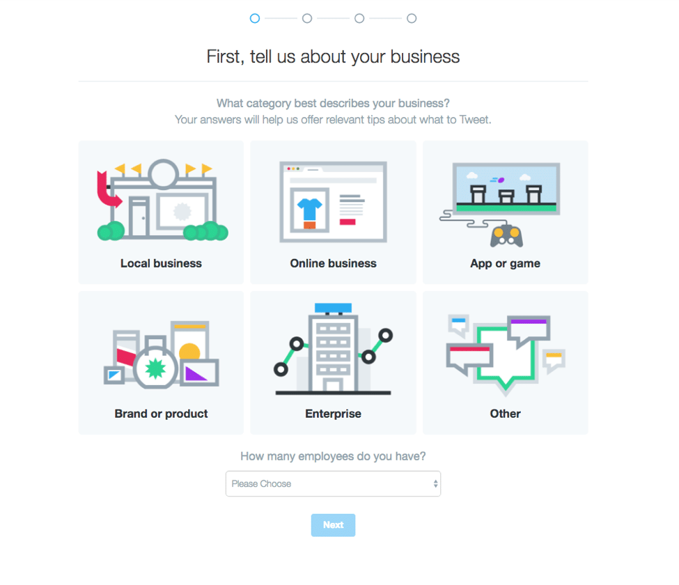
Right off the bat Dashboard asks what kind of business you are and how many employees you have. Pretty standard.
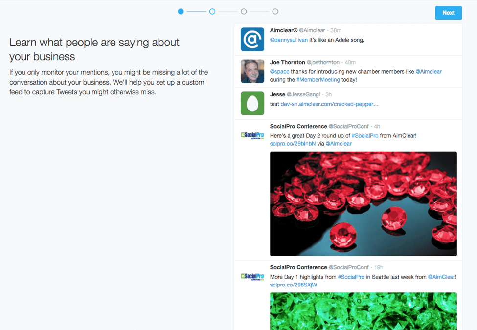
We noted that whatever we selected here didn’t seem to change what we saw next, so we weren’t sure what the purpose was other than for Twitter to gather some data. Dashboard then sent us to a page reminding us what all good CMs know: You can’t just monitor your @mentions and call it a day. It kindly gave us a like look at our @mention stream, in case we hadn’t seen it. This made it pretty apparent to us that Twitter Dashboard is aimed squarely at the business that doesn’t check its Twitter account very often, or ever at all.
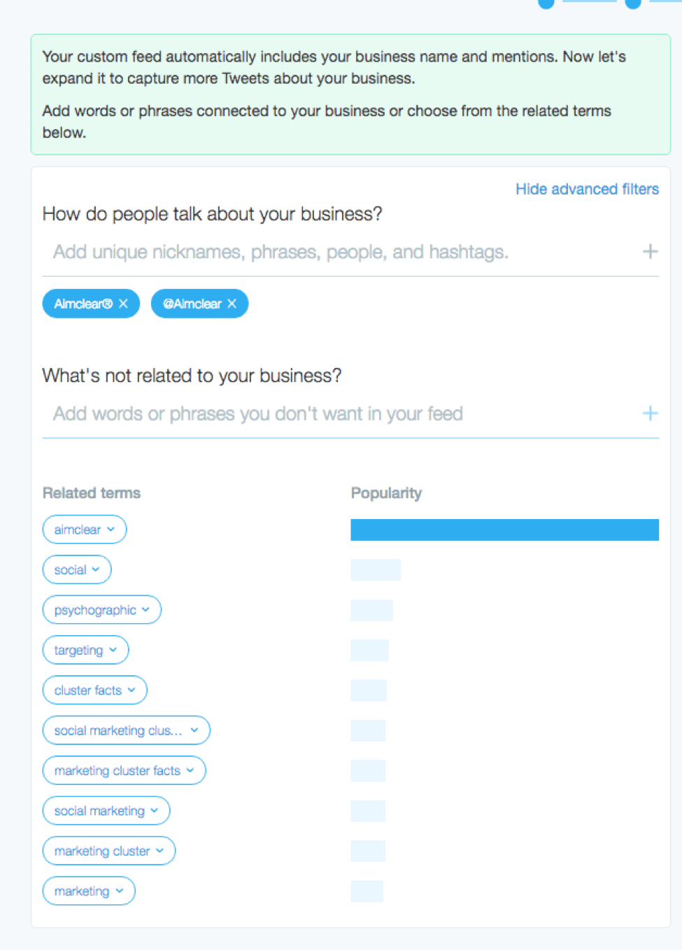
Clicking the next button took us to a custom feed builder for adding monitoring terms we’d like to hear conversations about. We began adding keywords we would normally monitor, and in fact already do monitor in various streams, hashtags and lists we have set up in other tools. As we did this, the “About you” column on the right live-updated every time we added or excluded something new. It was handy powerful to see how different terms affected the listening feed we were trying to build.
After entering a handful of monitoring terms, there was a lot of junk in the feed, which is pretty normal when building out new monitoring feeds. You’ll always get the spammers and the article-du-jour that receives so many retweets (many of them spam themselves) that it drowns out the stuff you actually want to see in your feed. Dashboard includes an easy way to exclude terms from the monitoring feed so a user or business trying this for the first time can filter out things they aren’t interested in seeing. Most CMs know you can use “AND NOT” or “-” to exclude unwanted material from your listening feed; putting exclusions up front in Dashboard brings that handy trick to everyone in an easier way.
Exclusions are the only filtering option in Dashboard. There’s no ability to sort by image, video, top tweets or accounts as there is on the main web interface. The feed you build is simply given back to you in reverse-chronological order just like the Twitter feed of old. This keeps with Dashboard’s purpose of being uncomplicated for businesses trying to come to grips with the massive beast Twitter can often be.
But we wonder: Is it actually too simple? If Dashboard is meant to help ease infrequent or hesitant users into Twitter, wouldn’t a basic keyword monitoring function be better off augmented by some type of quality filtering ” even if it’s done by an algorithm and not by active exclusions?
When we click through to finish adding the keywords we want to monitor, we then have the opportunity to save the feed. Up in the corner is a gray edit button to take you right back to the keyword tool. Very nice! Twitter would be good to throw in a reminder now and then to Dashboard users that they can go back and edit their feed if they don’t like what they see or want to see something different.
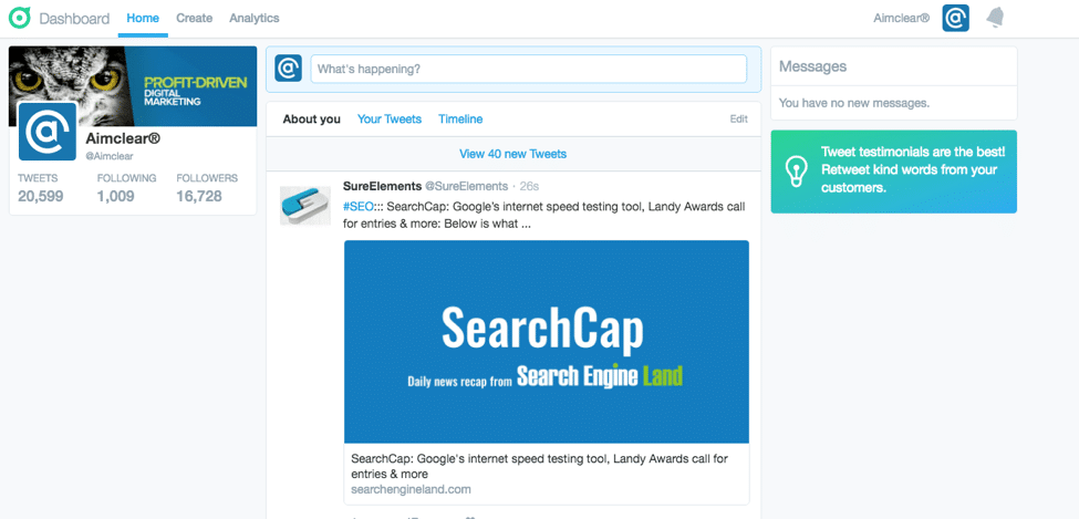
While we’re here, let’s poke around the Dashboard on the web. It looks a lot like the normal Twitter web interface, but there are key differences. Across the top, Dashboard serves up your Home (which includes the About you feed we just built, Your Tweets and your Timeline), your icon in the upper right for logging out or viewing your profile, and a notification icon to the right of that.
What’s different about this than the normal Twitter home page? The Moments tab is gone (maybe indicating Twitter doesn’t see this as a valuable feature for this user segment) and direct messages hangs out on the right side next to your timelines instead of along the top. Unfortunately, we noticed that when you have a new message it simply says “You have 1 new message” without any kind of notification badge, which you’d get in the regular Twitter for web. When you click the Notifications icon, you get the normal notifications feed “no option for filtering it down to just Mentions as you can with the regular Twitter interface. That may be because @mentions are included in the About you feed we built, but if you built out a really robust feed there, your @mentions may get buried.
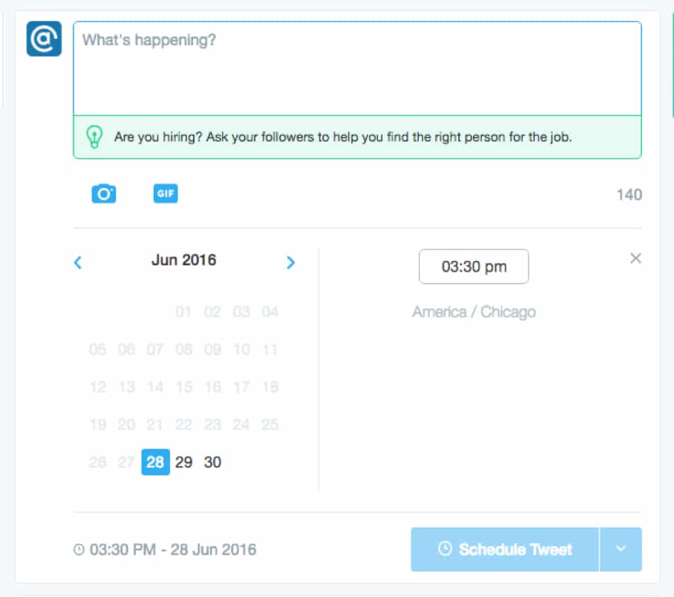
Moving to the Create section is where we find Twitter’s most up-front implementation of a scheduled tweets feature. Scheduling tweets has been a bedrock feature of tools like Hootsuite, Tweetdeck and several others. It’s even possible through Twitter’s web interface if you go in through your Twitter Ads account. Facebook implemented the feature for brands ages ago, and with Dashboard now Twitter users have scheduling at the forefront. The UI itself is pretty straightforward and not terribly different from the regular browser-based tweet composer.
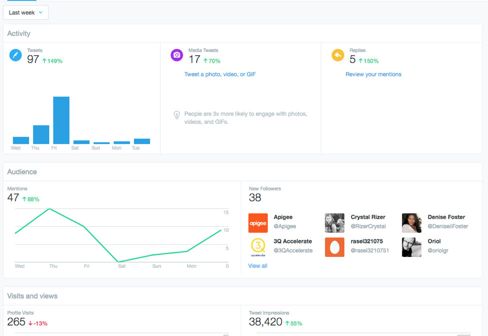
Analytics in Dashboard is a 38,000-foot view of basic account performance. You can look at the last 7, 30 or 60 days, unlike regular analytics which lets you set a custom timeframe (there’s no export data option in Dashboard either).
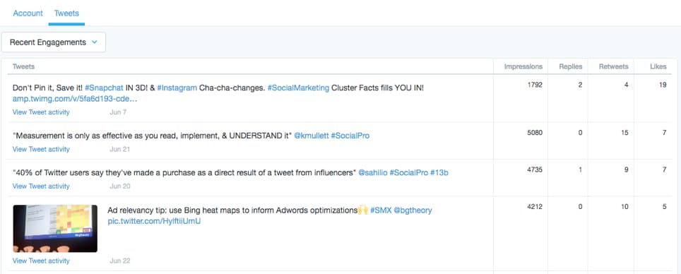
You’ll get a basic overview of tweets and replies during the selected time period, how many @mentions you’ve had, overall impressions and profile visits. It also lets you look at performance for individual tweets including their impressions, replies, retweets and likes. It’s a simplified version of the Twitter Analytics we’ve grown accustomed to (in fact, if you click View Tweet activity, it will take you into the traditional analytics to view more detailed summaries) and probably enough for the users Twitter hopes will use Dashboard.
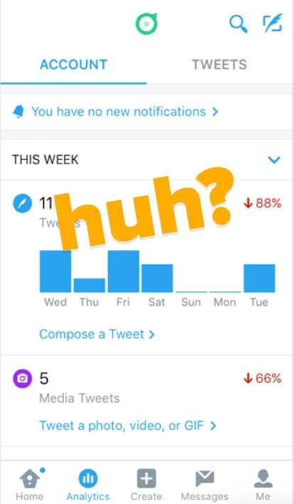
Moving to the Dashboard app (on iOS), things are in the same place you find them on the web… except for notifications. Here, notifications got moved into the Analytics section, which is somewhat mystifying. It does make the reply button on each tweet much bigger, which makes sense if one of the points of Dashboard is to prompt businesses to interact more and makes it all the more confusing why it would hide your notifications under Analytics.
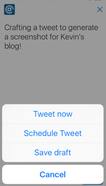
The Create tab also replicates the web tool and uses a two-step process to drafting, then determining when you’d like your tweet to be published.
Debriefin’ Dashboard
So that’s the Twitter Dashboard in a nutshell. (We never quite did get back to why Twitter needed to know what kind of business we are or how many employees we have. Hmm.) It’s a tool designed for small businesses that may not have the time or resources for more thorough community management, and it shows by the way it makes listening a priority and simplifies analytics. As Twitter looks to get new users and engage or re-engage existing ones, those are two good places to start.
But is it the “powerful” tool Twitter characterized it as? If you want to go really Jony Ive on things, there is power in simplicity and Dashboard represents a simplified version of what users find with Twitter’s traditional web and mobile apps. But simplifying can also sacrifice functionality, and Twitter did that with Dashboard in a few ways:
- Analytics. Twitter’s traditional Analytics section gives you more data and more ways to slice and dice it. Twitter might think that’s too much for Dashboard’s intended audience, and that’s okay. But why not rethink Analytics further? Do unsure Twitter users really need their first look at analytics to include profile visits? Putting link click numbers here would help show them their tweets actually serve a purpose beyond Twitter. Giving them a notification badge every time someone clicks a link would be even better ” an instant visual cue that there is activity happening in their account.
- Notifications. Being able to filter your notifications down to only @mentions is a minor feature in the scheme of things, but it’s a convenient one for when you want to see who you need to respond to. Twitter’s goal with Dashboard is to get businesses to focus their engagement beyond just their @mentions, but not having a clear way to find them and only them in Dashboard is a detriment.
- Messages. Moving your Messages out of the top menu and taking away the notification badge is also curious if the point is to use Dashboard as a tool for small business Twitter management. Maybe Twitter did a/b testing to show moving Messages closer to the timeline is more effective than signifying new messages with a badge along the top? If not, this is a strange decision.
- Listening. What’s one of the most common threads in every screed on why Twitter struggles with new users? “The feed is too chaotic!” Lacking any type of quality filtering, the listening feed users build in Dashboard will be just as chaotic as a regular timeline, the only real difference being the chaos is focused around the handful of keywords a user enters.
Which gets us into our last topic of Dashboard’s role in the Twitter universe and what it could mean in the future. We mentioned at the beginning how you won’t find Dashboard if you log in to twitter.com or the regular mobile app. This makes Dashboard (dashboard.twitter.com) a totally separate experience. With its release, Twitter has become like any software tool that split itself into two product lines. Dashboard represents the “consumer” version for new, less experienced users while traditional Twitter serves the experienced “pro” users who have grown accustomed to the chaos or want the more in-depth analytics data.
Think about how features and people move between versions in that environment. Power features are introduced at the pro level, then refined and simplified for the consumer version. Pro users have no trouble going “down” to the consumer version, even though they might miss the advanced features. Some consumer-level users will go pro when they get more experienced and many others are happy right where they are.
So much analysis around the social network’s future has focused on how to make Twitter everything to everyone. How will it calm the timeline? How will it soften the learning curve to new users? How will it do that without alienating long-time users? But based on our first look at Dashboard, the company seems to be taking a different approach. By introducing a whole new, much simplified tool aimed at the vital audience of new and barely active existing users, it leaves the Twitter its most active members have grown used to over the past decade intact.
In this construct, Dashboard is where we could see a News Feed-style algorithm truly take center stage. Without a decade’s worth of being addicted to the reverse-chron feed, would Dashboard users care or even notice that their feed is out of order? Doubtful, and they’ve been conditioned to it in Facebook anyway. The stalwarts who vociferously oppose anything resembling a News Feed would still have the feed they know and love, plus all new users to interact with. Wins all around.
Twitter Dashboard won’t be replacing our existing Twitter CM and listening tools (Tweetdeck, Hootsuite, Sysomos Heartbeat, etc) anytime soon, and we think it could do a better job of calming Twitter’s chaotic qualities. But we are interested in watching how Dashboard develops, the place it takes in the Twitter universe and if it can help put the second most powerful social network on solid footing for the future.
