“Reimagination” Run Amok
The airline quietly reshuffled longstanding service definitions and perks, then changed where and how your eyes land first when booking a flight. Delta erased years of hard-earned user-behavior training and ding’d high-value loyalty along the way.
Delta Spent Years Honing the Customer Reflex
Give marketers and UX designers credit where it’s due: Delta’s fare structure and booking architecture were a successful and elegant piece of behavioral design.
On the economical side, there are two categories. Main Cabin and Basic Economy. Clean labels, consistent placement, unmistakable product separation. Booking-after-booking, year-after-year, a consistent nomenclature and UX efficiently trained millions of frequent flyers into an automatic decision pattern: ignore Economy, purchase Main, move on with your life. No deliberation, no comparison, no friction.
For Delta, the trained reflex was pure gold. Loyal customers self-sorted into higher-cost products without needing to be convinced. Frequent business fliers who flew ten, twenty, or fifty times a year stopped reading economy options entirely. They recognized their product and clicked and converted without persuasion, among the cleanest sales processes in commercial aviation.
For customers, the reflex carried its own reward. You knew what you were buying, every time, without parsing fine print or dodging traps. The airline curated what trust actually feels like when it’s working: confidence in a system that behaved predictably, even above the lowest price.
Delta built that reflex deliberately, maintained it for decades, and undoubtedly profited from it enormously. Recently, they seemed to turn it into a bait and switch, perhaps unwittingly.
The Two-Step Mechanism: A Booking Flow Rebuilt to Exploit Muscle Memory
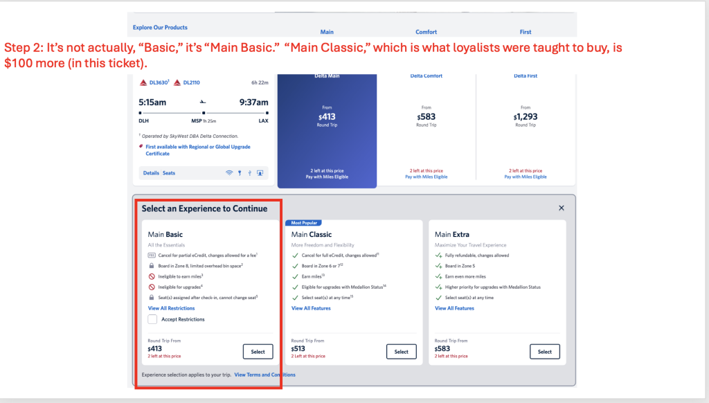
Here’s what changed in recent months: Delta folded Basic Economy under a new umbrella called “Delta Main” and relabeled it “Main Basic.” The previous standard Main Cabin became “Main Classic,” a moniker pre-applied, in the last iteration of the UX, ostensibly to smooth the transition. Both now live under the same parent brand. The product behind each tier? At a glance, identical to what existed before, Economy and Main. But at closer examination of small bullet points and fine print, users discover new, unnecessary confusion and annoyances.
That sequence is the entire play. The outcome, a breach of trust.
Step one: You search for a flight. The results page shows “Delta Main” at $413 for a Minneapolis-to-Madison nonstop. No “Economy” label anywhere. No signal that this price represents the heavily restricted product you spent years training yourself to skip as a frequent business traveler. You see the word “Main,” recognize your product, and click. Purchase intent is now set (along with an expectation of the $413 fare for flexible, perk-heavy travel).
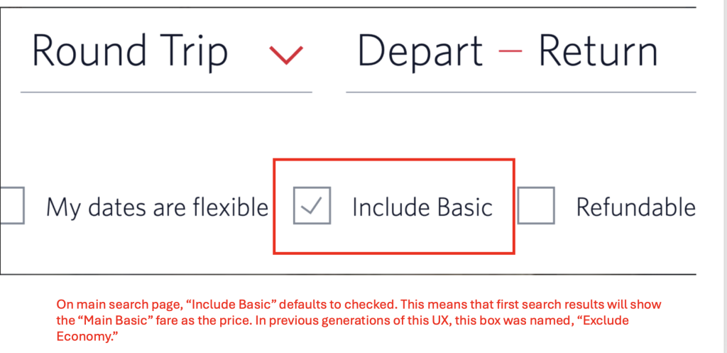
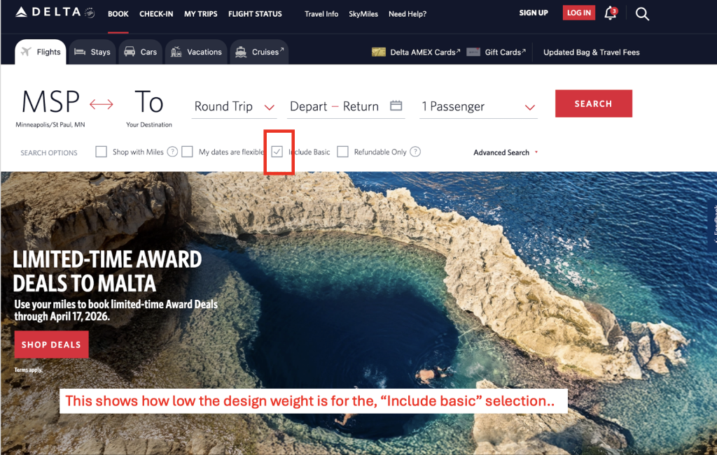
For perspective on design weight, the default checks a tiny “Include Basic” – which used to say “Exclude Economy”
Step two: A new page appears with two options side by side. Main Basic at $413. Main Classic at $513. Both wearing the same “Main” badge. Both framed as sub-tiers of the product you already decided to buy.
The $100 difference between Basic and Classic doesn’t register as the price of the standard product you always purchased. It registers as an upsell, a premium tier inside a category you already chose. The heavily restricted product is now the apparent default, and the standard product you’ve been accustomed to is now the upgrade.
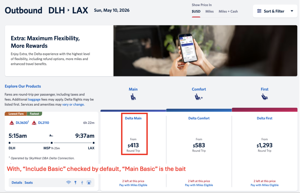
That inversion is the actual redesign, presumably built to dangle fares that compete with Frontier, Sun Country, Spirit, and travelers deciding on price alone. Get users to drill further into the process before buying or bailing.
What Delta forgot is that the frequent business traveler anticipates fare fluctuations. Sometimes you catch a deal, sometimes you don’t. But you pay for, and expect, a two-way sense of trust and loyalty. They’re used to seeing the expected price on the surface – never seeking the lowest cost, but actually anticipating a higher cost. Done.
The “Ignore-Filter” and Why Delta Torched a Highly Valuable Behavioral Asset
When customers interact with the same product architecture repeatedly over years, they develop what functions as an ignore-filter: an automatic perceptual skip that removes entire categories from conscious evaluation. Economy fares weren’t something business travelers weighed against Main. They were invisible. The label triggered instant, unconscious dismissal. Frequent travelers, particularly those managing shifting priorities and availability, expected the perks built up over hundreds of thousands of SkyMiles.
That filter was so valuable to Delta that “ignore economy” became a longstanding default filter option in the booking system itself. Loyal customers put a premium on earning maximum miles, cancellation flexibility, and lounge access commensurate with their AMEX cards and/or status perks when booking. The ignore-filter eliminated an entire class of competitive friction and delivered Delta’s most profitable customers straight to the higher-margin product, pre-sold and pre-committed.
Building that kind of automatic customer behavior takes years of consistent signaling. Stable labels, clear product boundaries, and predictable architecture, all maintained long enough for conscious decisions to become unconscious ones.
As a longstanding Delta traveler, I can tell you exactly how this feels: you think you scored a low-cost flight, and then you discover you need to pay significantly more to get back to the level you’ve relied on for years. Worse yet, even at the $100 upcharge, Delta still held back some of the features, invaluable flexibility for frequent fliers, that have been the default for years.
Who Gets Alienated? The Customers Delta Can Least Afford to Lose
Here’s the part that should make brand strategists wince.
A casual traveler booking one trip a year has no trained expectations about what “Main” means. Every label is equally unfamiliar. Good. The two-step flow reads as a neutral set of options. No trap fires because no conditioning exists to be exploited, no disappointment. Many travelers are searching for low-cost options. “Economy” is an expected and perfectly acceptable term for them.
The customers who walk straight into the booking mechanism are those with the deepest loyalty. They earn SkyMiles status because they automatically buy through the Delta app and website instead of using Expedia or other third-party booking services. They chose Delta over every competitive alternative for years and built their booking behavior around the longstanding fare (and rewards) architecture, because purchase intent locks in quickly at step one.
When loyal customers reach step two, read the fine-print restrictions on Main Basic, they discover that their presumed usual level (“Main”) no longer includes Sky Club access, upgrades, full miles accrual, redeposit of miles when canceling, fee-free same day rebooking, etc. Sure, call this a first-world problem if you want. But Delta ignored the fact that blindly nesting economy options under main and burying it in step two would create real aggravation and genuine feelings of betrayal among travelers who booked because they trusted the system’s steadiness.
The loyalty that made them Delta’s most reliable revenue source is exactly what makes the trap so stupid. The longer the relationship, the stronger the conditioning. The stronger the conditioning, the less likely the customer is to keep booking trip after trip without shopping around.
Delta’s highest-margin customers are instead possibly downloading a United or American app for the first time in years. I did just that and won’t make Diamond status for the first time in about ten years. The irony is that nothing really changed except for the product names and flow. A savvy digital experience director would have built a different UX contingent on loyalty and status, because there would likely have been zero risk of revenue loss.
What Delta Gets Out of This, and What It Costs
The upside math is straightforward enough. Loyalists, holding their nose, will pay the ‘extra’ $100 to reach Classic, generating incremental revenue on a product they used to buy at the same, listed price. Some may settle into Basic, knowingly or not, and cost Delta less to serve: no lounge access, no upgrades to process, fewer miles to accrue. The entry-level price point competes better in search results against ultra-low-cost carriers. Eleven fare tiers generate granular willingness-to-pay data that feeds dynamic pricing models. I’m downgrading my Delta Platinum Amex card and relying on other card products to get into the Delta Sky Club.
Delta’s Chief Digital Officer framed the redesign as a customer benefit: more options, more flexibility, and a “reimagined shopping experience.” In reality, it manifests as eleven fare tiers presented as “simplification.” If you’re a marketer, you recognize the script. It’s the language companies use when the real audience for the news is the investor deck, as opposed to the customer.
The cost side of the ledger is harder to calculate but fairly easy to predict. Trust, once broken with high-value customers, doesn’t degrade linearly. It can drop like a brick.
In 2025, customer experience research firm Forsta studied the impact of negative experiences on brand trust. The survey of 4,000 consumers confirmed brand loyalty is extremely fragile, with 63% of customers willing to defect after just one or two negative experiences. This data codifies the non-linear “brick drop” in trust, illustrating that minor repeated frustrations or a single transparency failure can instantly trigger customer churn.
In the case of Delta, a Diamond Skymiles member who feels manipulated doesn’t quietly downgrade their loyalty by 10%. They start looking at United and write about the experience in blogs. They grouse with fellow frequent travelers. The customers most likely to detect the pattern are the most networked, most vocal, and most influential travelers in Delta’s ecosystem.
Delta may be betting that the revenue gain across millions of bookings outweighs the trust damage concentrated in its highest-value segment, or their DXO may be the kind of professional who’d redesign a perfectly functioning door and somehow make it harder to open – and then boast about “reimagining a pathway forward.” Such a bet might hold for a quarter or two, but brand-trust math tends to work on a longer timeline, often with a harsher downside.
The Marketing Lesson: Decision Architecture Is the Most Powerful Tool You’re Not Auditing
Strip the airline context away and what Delta built is a clean case study in decision architecture manipulation, one that applies to SaaS pricing pages, e-commerce checkout flows, subscription tier design, and anywhere else customers make sequential purchase decisions.
The core mechanism has three parts, and every marketer should be able to spot them:
Trained behavior as an attack surface: Any time you’ve spent years conditioning customers to associate a label with a product, renaming the label without changing the product creates an exploit. The customer’s trust transfers to the new label automatically, because the trust was earned through the pattern, not the product alone.
Sequential commitment as framing control: When purchase intent forms before the real decision appears, the second step doesn’t read as a choice. It reads as a modification of a choice already made. Step one sets the anchor. Step two exploits it. The sequence is the strategy. Don’t wreck a proven sequence.
Loyalty inversion: The customers with the strongest relationship to a known architecture are the most susceptible to frustration over a change and perceived downgrade. The deeper the trust, the harder the landing.
Delta messed with definitions and structure, apparently without thinking through the consequences for the customers who trusted that structure most. They changed the order in which information reaches a customer’s brain, and they counted on decades of carefully built loyalty to keep people from noticing until it was too late.
This ultimately can result in a trust liquidation event disguised as a “reimagined” customer experience.
Smart brands curate behavioral patterns that become assets: automatic customer reflexes built over years of consistent experience. Whether it’s your website, mobile app, or in-store checkout experience, those assets can be maintained, or they can be spent. Delta seemingly chose to spend theirs. The question for other brands watching is whether a short-term conversion lift is worth what it costs when your best customers figure out what you did and then deconstruct it publicly.