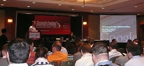
A hallmark of the Search Engine Strategies conferences has been the “first look” and stage demoing of bleeding edge search marketing tools before they go live and eventually change the world.
Rather than the unveiling of a brand new tool performing functions we didn’t know we needed, the search marketing community at SESNY 09 received something long asked for (and long overdue) with the Google Workshop: Preview the New Adwords Interface session.
Google Adwords product lead Ariel Bardin & engineering lead Angela Lai were excited to share the new tool with us, with the admittedly “selfish” goal of receiving feedback to further improve it.
So Why Update Adwords?
In the past, new report types, bidding types and ad formats have been added, but now its time to take a step back; to analyze and understand everyday things to make our user’s lives easier. So Google traveled the world, going as far as India and China, talking to advertisers large and small. One visit in particular in Mumbai stuck out to Bardin, a travel agency that previously could not have operated without PPC and Adwords. How else could this quaint Indian shop find someone in Canada that wants to take a trip to India?
What Google Found
Google looked at tasks, anything that was task intensive, including things like digging through Adwords to find a low performing keyword and the editing interface in general.
The New Adwords Interface In A Nutshell
- ROI improvement, more transparent, more data, but more importantly – more context for the data.
- Efficiency, everyone wants to be able to use Adwords quickly to move on to other things.
- Clarity, it should be intuitive to make sure you can actually learn to use all of these tools.
A Walkthrough of Where Adwords Currently Needs Improvement
Their is the cumbersome task of finding your most expensive keyword, where is it? The campaign and ad group structure gets in the way and you’re not seeing keywords across ad groups/accounts.
Today they have a report center where you can create a new report, but the report still just looks and acts like a piece of paper. Where’s the editing functionality?
Ariel Bardin Demos the New Adwords Interface
Ariel notes that during the new Adwords trial, you can switch back and forth between the current and new interfaces. Be sure to give Google feedback, it’s not going into a black hole, Ariel assures us that he and Angela will read it.
Back to the question, which is my most expensive keyword?
There is a now an account level keyword tab, click on that, sort by Max CPC and you now see your most expensive keyword
(an audience applause and then unsureness of their own clapping)
The Tree Navigator allows you to jump between different adgroups easily
In regards to clarity, there’s a new Adwords help widget that conditionally changes depending on what they’re doing
For the power users, there are now keyboard shortcuts, jump around the whole UI without a mouse
The panels on the left of the interface are hidable for a cleaner work environment
Back to keywords, there is now inline editing you can do within the keyword tab across all accounts, changing match type and bid etc
The status includes a lot more information now, including quality score, components, relevance, landing pages, and any problems
Now you can edit everything within a report in the UI, you can jump around and use shortcuts in these keyword spreadsheets
You can now just click on a button to get to search query report, no going to the Report Center
Now you can pick a subset report and query just by keywords, again, across adgroups
The search query report is no longer a piece of paper. You can make certain keywords a negative, change match types, add keywords, set bids, all within the search query report interface
Copying good performing keywords from one campaign to another is now done with a simple copy option
(a papery yet earnest applause)
Ariel says you should expect to see more functionality in getting Adwords information out, integrating into excel etc.
You can now apply business rules in a filter, find keywords you care about, and apply a quick bulk change
You can create multiple filters to create complex business rules and save them for future use
Better integration Google Analytics functions, comparing multiple options such as impressions vs costs, updating in real time
What’s changed in context? At nearly every level you’ll be able to easily analyze performance over time
Expect access to more data types in the future, Ariel stresses user feedback again
Editing ads is simplified, editing ads can take place right where you see it
(audience claps like thunderous team of horses)
Google will now start showing “pending approval” in status, and you can utilize this by setting a filter
Ariel begins creating a new ad, again it’s the same location, no separate wizards
Ariel sets up a filter to show all disapproved ads, and editing in line allows you to tweak it at once
Adwords now has automatic placement, if you give Adwords your keywords, the tool automatically figures out where you can run on the content network
You can see the domains of all content network sites your ads are running, you can examine CTF per domain, if you want more control, you can add this to managed placements, where you can set a bid, you can treat them much like you treat keywords, and you can change your bid to get more exposure on the specific domain
You can also exclude domains in the content network
(audience is now clapping like an excitable colony of rabbits)
Ariel queried the crowd about the changes, who seemed to completely agree that the changes are good
Ariel then invited Angela to speak on the technology behind the new interface.
Angela Lai Presents the Technology Behind the New Adwords Interface
Angela wanted to give background on the three primary design principles leading to the new interface
Speed Matters – Response time of the app should be good for advertisers, lends itself to quick task completion, consolidating redundant tasks and needless navigation
Give guidance at the right time – The help widget is in context and the help context changes, there is a greater integration of knowledge base. Google wants to give you a lot of information, but they also allow you to “zip away” things when you don’t need them, like the hidable left panel. You can maximize your screenspace at will to help focus your work.
Context is aided when viewing and editing your data takes place in the same location. Having the data inline with your editing goes a long way towrds this.
Consistency – Frustration over the “million ways” to find a button to edit things, the edit function tries to be uniform everywhere you find it. Things as simple the differnt color schemes of editing vs data panels, differentiating between data you provide and data adwords show you as well.
Powered By Google Web Toolkit
This is the inhouse tool for adwords, it gives you an asynchronous AJAX interface, for richer interaction, the page is much more interactive overall.
New Infrastructure of Data at Your Fingertips
More backend infrastructure overall to support the data being shown, filtering and sorting happens quicker because they put more google technology behind the advertising platform Expect new features in the next couple of weeks, the demo’ed CTR keyword level sorting can be automated into an alert format.
(firecrackery applause)
All products they do are a work in progress, they believe in launching early and using feedback and they will be rolling out several more changes over the next weeks and months as feedback comes in, and “hissing” is very very welcome.
Bardin closed by asking the lucky SES NY crowd to signup to demo the new interface by visiting http://www.google.com/adwords/sesny
The new Adwords tool represents an amazing leap forward not just in terms of technology, but in workflow and ease of use. As Bardin and Lai have proven in this session, Google does read and integrate user feedback, it doesn’t just fall into a black void.

