
Step 5: Audio, Video, Forms and Design
Videos and Audio
/>
- Take stock of your videos to ensure all videos
have captioning or transcripts. Ensure your users can pause and control the video speed to make the content
work for their individual needs.
Pro Tip: The simplest way to make this a reality is to upload your
videos to YouTube and then embed the videos into your site.
- Avoid producing images or videos that could induce seizures. We’ve all encountered videos so in-your-face that you have to avert your eyes and
scroll quickly away. Don’t do this. Videos or images with more than three flashes per second can negatively
affect the health of a user, and have on occasion induced seizures. - Audio and Visual Transcripts and captions for multimedia are essential. The quality of these materials is also important.
- For audio-only content, such a podcast,
provide a transcript. - For audio and visual content, such as training
videos, provide a transcript and also provide captions.- Include important non-spoken
information such as, “eerie music plays,” “door slams” or €˜Michelle leaves the
room’.
- Include important non-spoken
- Captions should be synchronised to the media
being displayed. - WCAG Best Practices Resources for Audio and
Video Content
- For audio-only content, such a podcast,
Forms
Forms need to be simple. If you’re requiring your user to complete a form, the only
thing that should be on the page is the form. A good example are login pages – they should contain only the
essential fields required to login. Users should not have to scroll past ads or other content to login.
Here is a brief checklist to help you review your web site’s forms:
- Provide clear instructions. Ensure there are
instructions at the top of each form’s page. - Label fields clearly with requirements. Ensure each
field’s label is viewable at all times with the required input. Example: “Date of Birth: 00/00/0000”
We’ve all experienced frustration trying to fill out a web form. You click into the
field and can no longer see what you need to type. You then click out of the field to see what the field was for
and/or check to see how the information has to be formatted. Imagine this experience as a user with limited
ability.
- Ensure that users are notified if they were successful
at completing the form. - Ensure that form error messages are clear and provide
instructions to help users correct mistakes. - Forms should not be subject to a time limit; allow
users to complete the form at their own pace. There may be times when a time limit needs to be in place, for
example, for security reasons. In these instances, the users should have the option to turn the timer off or
extend the allotted time. This restriction does not apply if the time limit is due to a live event, such as
an auction or a game, or if the time to complete the form is essential for a valid submission.
We recently tested a site that has a pop-up with a thirty second time limit after an
item is added to the cart. The user has to either click a “Continue shopping” or a “Go to check out” button
within 30 seconds. The screen reader we were testing didn’t see or read the pop-up. Tabbing also didn’t focus on
the pop-up. For a blind user trying to continue shopping or go to the checkout this would be very confusing and
they would be stuck.
We’ve also seen instances where time expires and the user is logged out of their
account and/or the cart emptied for not clicking the, “continue shopping” button.
As you can see, many of the suggestions for better form accessibility (as with previous
on-page elements) align with best practices for all user’s experience,
not just those with limited abilities. Learn more about Forms Concepts €¢ Forms €¢ WAI Web
Accessibility Tutorials
WCAG Contrast Checker
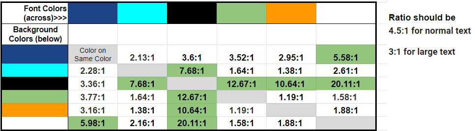
We mentioned earlier the importance of contrast, and how different colors, fonts, and
light conditions can affect the ability of a user to read and navigate a site. Review the contrast of your brand,
website, and app colors in content – comparing backgrounds, fonts and
effects. The minimum required contrast is a 4.5:1 ratio and the recommended contrast is a 7:1 ratio.
- Use a WCAG Contrast Checker tool to check the color
contrast ratio of your content colors. There are great extensions for Chrome and other tools to get you
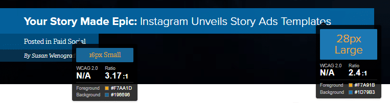
started. Here are a few: - Ensure that roll-over effects don’t have any color
ratio issues (like blue-on-blue as our site did below). The default blue roll-over was something we hadn’t
even noticed but have since addressed. Below are a handful of examples of text and roll over
issues:- Headline (H1) is white on a blue
background which is just fine. But once someone moused over the title, the font turned blue
on a blue background – which made the text nearly disappear for everyone.
- Headline (H1) is white on a blue

- Some fonts turned from white to orange
which worked fine for a couple of the blues, but not for all of the blues nor all of the
font sizes.
- Some fonts turned from white to orange

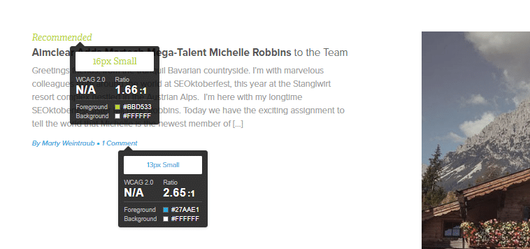
- Our green-colored font on a white
background wasn’t compliant because the color contrast ratio wasn’t high enough.
- Our green-colored font on a white

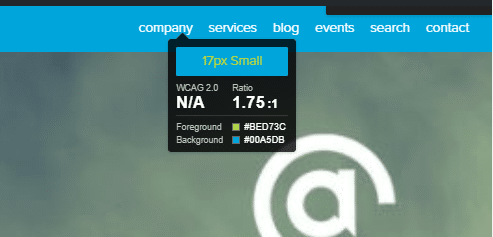
- Same for the green font rollover
effect on the blue navigation bar.
- Same for the green font rollover


Pro Tip: Lay out your brand colors in a spreadsheet and compare the
font color codes versus the background color codes found in your content to understand where colors are
compliant. Include white and black, you may be surprised that not all of your colors have enough contrast even
on a white background.
What’s Next?
Now that you’ve read through how you can make your site forms, audio, video and other design elements accessible to all,
check out what’s next for making your web sites
& apps accessible, or pop back through the previous sections using the table of contents below. And be sure
to download a PDF copy of this guide – just click the button below!
The AIMCLEAR Guide to Web Accessibility and WCAG Best Practices
A Guide to Help Make Your Content Accessible
5 Steps to WCAG Compliance and A Better User Experience
- Step
1: Web Accessibility Statement- Step
2: Preliminary WCAG Tests and Checks- Step
3: Going Mobile- Step
4: Accessible Off and On-Page Elements (Your SEO was right)- Step
5: Audio, Video, Forms and DesignSummary and Next Steps