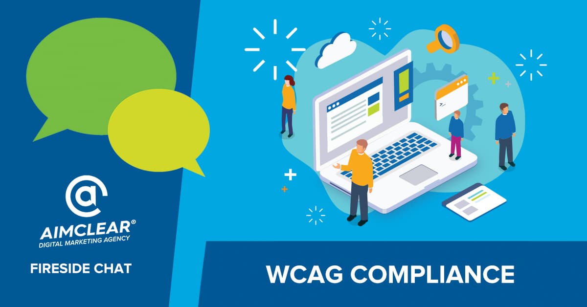
Every Friday our AIMCLEARians host a discussion about what’s on our minds, what we are hearing in the industry, and more. In this week’s discussion we review web accessibility from a design, web development, user experience, and SEO perspective in our WCAG Compliance Fireside Chat.
Read Our WCAG Compliance Friday Fireside Chat
Lea: Happy Friday, everyone.
All right, welcome to today’s Fireside Chat, all about web accessibility and compliance. With us today, we have our web developer here at AIMCLEAR, Sarah Shilinski and our graphics designer, Brittany Dubina. And then I always forget myself. We’re going to do it today. I’m Lea Scudamore. I’m the SEO and I am certified in WCAG, which is web content accessibility guidelines.
When we get into this, one of my favorite quotes is from Shawn Lawton Henry at the W3C, and her quote is, “People are not disabled. It’s bad design around them that is disabling.”
Sara: Truth.
Lea: That’s very, very true.
What we’re going to be talking about today is web accessibility from a design and development, as well as an SEO perspective. But before we get going, we have a question and we’re polling the audience!
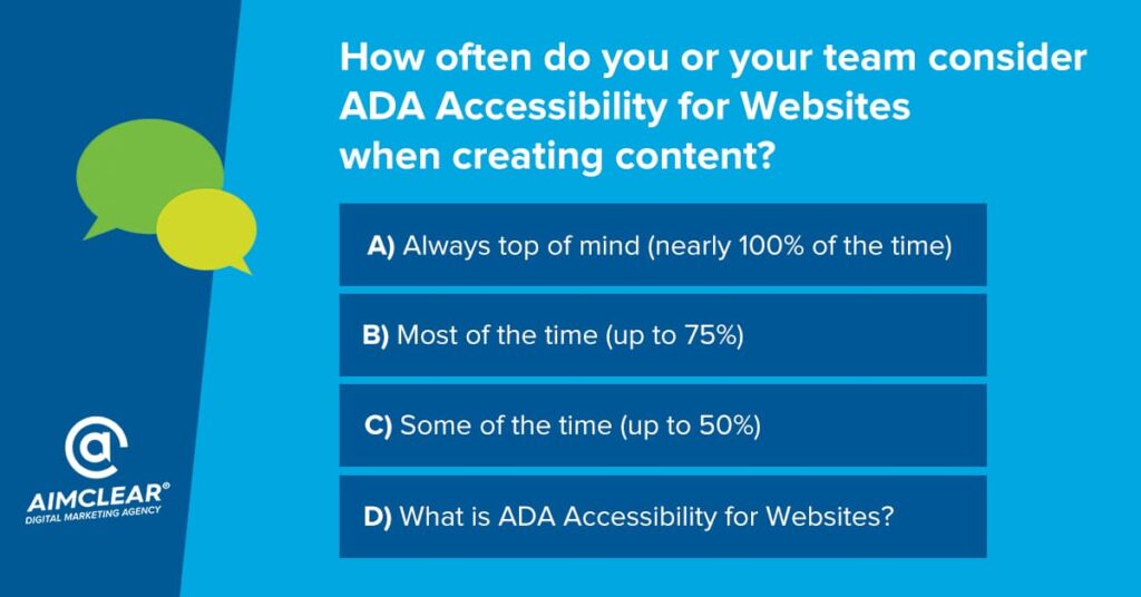
So, please answer: How often do you or your team consider ADA accessibility for websites when creating content?
A: Always top of mind, nearly a hundred percent of the time,
B: Most of the time, up to 75% of the time,
C: Some of the time up, to 50%,
D: and then what is ADA accessibility for websites?
Sara, why don’t you kick us off? What do you think?
Sara: Well, personally, I know there’s always room for improvement. I would say probably B: 70- 75% of the time. And like, especially when I’m working in things that are like hot button, like easily not accessible things. You know, just whatever we’re discussing today. I know I keep it front of mind.
Lea: Perfect. And Brittany?
Brittany: I would echo Sara if I was being honest as well. Um, but honestly, before I even knew about this, I’d probably fall under D.
Lea: Yeah, the “What is it?” Yeah, I think that’s probably fair. I would probably go into the B range too into that 75%. Um, but always looking to improve, and I think we’re getting closer as a team to that hundred percent line. We’re getting there. That’s our goal. And I think we’ll always be working towards that goal.
So, what is web accessibility? What it is, is making sure that your website or web content works for everybody and is accessible for everybody with all abilities. What the “wee-cag” is, or WCAG or “wha-cag” or for short just “cag” because it sounds a lot prettier.
For more than 20 years, the worldwide web consortium, or the W3C, has provided web content accessibility guidelines, the WCAG, as recommendations for web developers and designers like us to encourage utilization of a set of standards and practices to best accommodate web users of varying abilities and diverse technologies.
3 Reasons WCAG Compliance is Essential
So, there’s three real reasons we worry about WCAG and web accessibility and making sure things are good to go. Number one is people, number two is money, and number three is lawsuits, which equals more money.
Let’s first dive into “people,” because 20% of Americans have an ability that affects the way they use the web. Let’s just let that sink in. That’s one in five. These abilities range from things that are like lifting and gripping and difficulty holding things like our happy little mobile devices, vision difficulty, hearing difficulty, complete hearing loss. And we also have to remember when we’re developing content, that our population in the US as a whole is getting much older with our baby boomers. We want to make sure that we’re continually making things easier for people.
Sara: Yeah. And the second reason we care is money! Money, money, money! If you knew 20% of your site users weren’t able to use your site, wouldn’t you want to fix it? That’s 20% of the contact. 20% of the people trying to check out at your website. If your site is not web accessible for those users, that’s money walking out the door. So, that is why we care.
Brittney: And finally, lawsuits. We don’t like those, and we don’t want them. And unfortunately, statistics state that a new lawsuit is filed every hour of the work week because of website accessibility. So, in short, federal laws like Title III of the American with Disabilities Act and its sister, the Rehabilitation Act required businesses and government agencies to ensure online content is free of barriers that would make it difficult or impossible for people with disabilities to make use of that.
Lea: Right
Brittney: Yeah. The regulations of those laws saying that WCAG 2.0 Success Criteria is the standard for both web and non-web electronic content.
Lea: Exactly. So, it’s really important that we all work on our perception and get developers and designers and SEOs and content creators on the same page and start talking about web accessibility and thinking about people before we start thinking about processes.
In our line of work, we really like those checklists. We love checklists. But the thing is, there isn’t a checklist out there that’s going to work a hundred percent for everybody. And if you planned it so like a hundred percent of the time, it works perfect for a braille display user, it’s going to make it completely inaccessible for another type of assistive technology.
If we had to make a list of tips, though, I think we can make that. You guys jump in when you’ve got stuff, but I’m going to start mine off with: Write a web accessibility statement. Make sure it includes plain English, it isn’t legalese, it has to be short sentences that makes sense and tell the users where your site’s at, where you’re hoping to go, and if they run into a problem, an email address of where they can contact somebody to get help.
That’s super important. We also want to make sure that your content isn’t so large that it’s a resource hog and it’s bogging down mobile devices that may be in a low coverage area. Because that is limiting their access to information and you need to make sure that that is not happening. That’s another one.
I think the biggest thing we’d all agree on is testing. WCAG testing and checks. Britt, why don’t you jump in and tell us your must do checks?
Design
Brittney: Sure. Um, make sure you’re implementing a sufficient color contrast. If you were to look at your site today, right now, chances are you’re going to find contrast issues on at least one page of your sites.
When color pairings are used without enough contrast, texts can be difficult or impossible for user with low vision or color vision deficiency to read. Even if you have no vision deficiencies, trying to read light yellow text on a white background isn’t the easiest, right?
Lea: No, it’s horrible.
Brittney: So, the only sustainable way to fix a contrast accessibility issue is to test it out; change the size of your texts, change the color of your text, or change the color of the background. But just remember the magic number of 4.5 to 1, that’s the minimal contrast ratio requirements.
And then, design, visually, a clear structure. Make it easy for a user to distinguish sections on a site such as your navigation menu, your links, your text section, et cetera. Reduce that clutter, utilize that whitespace, and make it easier for a user to scan it and understand it.
Lea: Perfect.
Brittney: Even within that, provide distinct styles for interactive elements such as your links and your buttons to make them easy to identify. From a visual perspective, links are often colored and underlined. Buttons are identified by shape. We want to make sure those stylings are also used consistently throughout your sites.
And then another thing is to make sure we ensure the navigate across pages within a website that has consistent meaning, styling and positioning. Because if it isn’t consistent, it can be particularly disruptive for those who are using screen readers and such.
For more on that, Sara, why don’t you take us into the weeds?
Development
Sara: That’s right. Strap your boots on. We’re getting into some code.
Lea: This is where I always get scared.
Sara: All right. It’s my happy place.
Lea: That’s why we have you.
Sara: Yes. Yeah, speaking of navigation, as Brittany was talking about, if your assistive technologies can’t navigate through your website, then… it’s bust, you know, the user will walk out the door, they can’t navigate.
So, the very first thing I would do would be to open your website, right now, go put your cursor in the address field and start pressing “tab.” See where the cursor goes, see how it navigates. Does it make sense? Is that where you want it to go? That’s important. Super important. There are many users with motor disabilities who rely on a keyboard. Blind users also typically use a keyboard for navigation. Those with lack of fine motor skills, birth defect, amputation. There are many, many, many reasons the keyboard works better than a mouse for a user.
Lea: Yeah.
Sara: Some users may use modified keyboards or even hardware that mimics the functionality of a keyboard. It’s still that keyboard navigation is important.
One thing that, as a developer, I need to know about is tab index. It’s a global attribute that you can apply to most HTML elements, and it controls two things: it controls if an element is focusable, or it can turn a noninteractive element into an interactive element. It also controls, at what point is it focusable? And it can take things out of the (it’s called the tab index) tab order, which is very important. Say, on a smaller screen size, maybe you’re hiding some content. Well, you don’t want that to be interacted with anymore, right? How many times have you tabbed through things and suddenly you don’t know where the tab cursor is? Lo and behold, it’s on some hidden modal somewhere. Well, that doesn’t make any sense, right? You need to be able to take things out of the tab order. When you write this in your code you do a “tab index equals”, and then a number. Negative numbers take it out of the tab order. Zero is the default position, which is best. If you’re adding something to the tab order, you use zero. You can also do a positive number, which would change where in the order it shows up. The first place your cursor will go is to a positive number, if there are any on your page, and then go through them one and going upward. This is not considered the best practice, but it’s doable. Sometimes we need to do fancy things and make things not normal, not default.
My second check would just generally be endorsing good syntax, good HTML syntax. All assistive technology is built around HTML syntax. So, if you’re writing good code, you’re most of the way there.
You need good semantics on your website. Like Brittany was mentioning, good intuitive web pages. This all translates to the accessibility tree, which is how assistive technologies are interpreting your webpage. Like our lovely visual here.
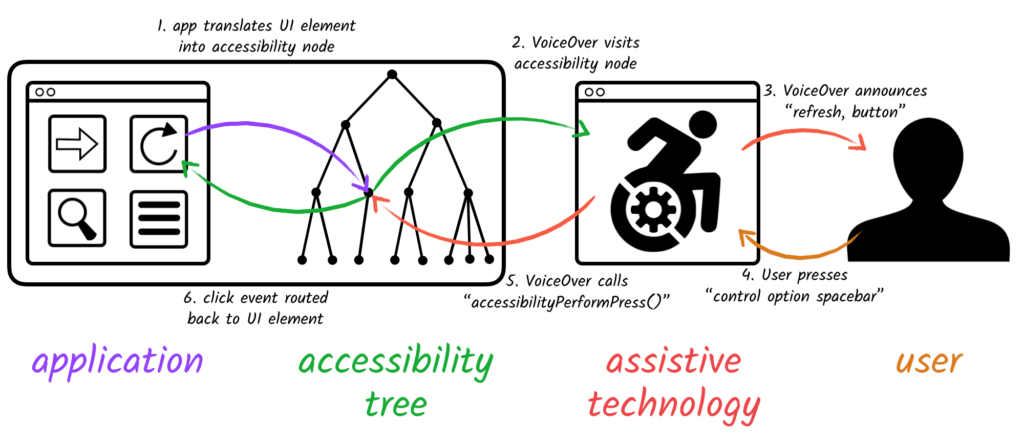
The accessibility tree interprets the DOM, your page, and it stores data for every element. It stores role, name, state and value. Most elements probably do not have state and value, but they will have a role and a name for sure. And then the accessibility tree hands that information off to assistive technology, like a screen reader.
And that’s kind of what the screen reader is reading as it goes down the page. And so, if you’re doing kind of real fancy, fancy, fancy development, making things interesting that are not just intuitive HTML, you’re making a div into a checkbox or something like that, you do need to tell the accessibility tree what the role is of that div or the name, which brings me to Aria.
Aria is how we do that. It’s how we want to round out our really well-written code into the best it can be for those assistive technologies. It doesn’t change the DOM, it doesn’t change behaviors on your page, it just allows you to edit the accessibility tree, which is important.
Lea: Yeah.
Sara: Because then we are telling the screen reader or what have you, what is happening on the page.
Lea: You’re making the fancy things work accessibly.
Sara: Yes. So, Aria stands for accessible rich internet applications. It’s a set of attributes that define the ways to make web content and web applications, especially those developed with JavaScript, more accessible to people with disabilities.
A few examples to help you understand what I mean: Like I mentioned before, maybe you’re making a super fancy form and there’s some real cool design elements to it that are not standard GUI for the browser.
Brittney: But we love fancy cool things!
Lea: We do. We want them to look pretty, so pretty.
Sara: I love them too. And that’s my favorite part of being a developer is making neat things that Brittany and I design. Super cool stuff.
Lea: You have, you really have
Sara: It just means that the standard HTML, which normally would tell the accessibility tree standard things, it means that we’re using it for something it’s not meant for maybe, like a div that we’re making into a check box for some reason. It’s all right. It happens.
So, we make everything special and cool. Well, then we need to tell the accessibility tree what it is, because that div is just a simple grouping element to the accessibility tree. We need to tell it the role, which in this case might be checkbox, it’s a checkbox now.
Lea: Perfect.
Sara: And it tells this system technology, how to interact with it better.
The other cool example, or just really important example, is, say your form submits and it has an error, and you know, your error pops up at the top of the page and a sighted user would see it, it’s big and red. Great. Well, someone using a screen reader still needs to know that’s there. So just to say that there is a specific role in Aria called “alert” that will immediately be red when that role happens, so the screen reader reads it right away. Then your non-sighted user is on the same page as the sighted user, and that’s really important. And you need to make it explicit. Tell Aria what the error is, and it’ll be read right away. It’s great. It’s useful. This is why we need Aria.
Lea: Right, right. That sounds like it’s really important and also super helpful. My favorite thing when it comes to those sorts of things with errors are the errors that don’t tell me what it is.
So like today, when I was trying to order my lunch, I had all these errors and I couldn’t figure it out and I had to go through each cell on the form to figure out which one I messed up. And it was how they wanted the expiration date for my credit card. They wanted, instead of the four digit, what I use, they wanted the six digits: the month and the full year.
And I didn’t know, and I’m going, “I don’t know which one, which one’s wrong? I just want a sandwich!” It was lunchtime. It was time to do this. I had kids and the whole thing. Those forms needing to have that information is super important too, it’s not just like “error 16, 52 41 hut.” Um, it’s just something that is legible and usable for everybody.
Some of my other checks when we’re going through our list of things we need to keep an eye on, is check out video and audio files and make sure they have transcripts and captions. We want to make sure that any forms are tab-able. And then also that the labels don’t disappear, like the label on my order form for my sandwich today, when I was trying to type it in, as soon as I started typing, it disappeared and I didn’t catch that I needed to do a different format.
So, Sara, do you want to talk to us about some of those other things you and I have been working on with forms?
Sara: Yeah, forms are probably one of the number one ways that our users interact with our webpages. You know, there’s a newsletter subscription, there’s a search bar, there’s contact forms. If you’re e-commerce, your entire checkout system is a series of forms usually. So, it’s obviously important that they work. And like we said earlier, money is walking out the door if they’re not working.
One of the easiest ways that I see these things broken is labels that, as Lea was saying, we take away the labels cause we as an industry, we love our really minimal clean designs. It’s just a series of boxes. No extra words.
Lea: Right. It’s just so fresh. And so clean.
Sara: It’s true! Like, it looks so nice, but does it work so nice?
Lea: Not always. Not always. Sometimes you just can’t get to the sandwich.
Sara: Yeah. So, there are good ways to do this. Make minimal design forms. You just have to be conscientious that you have to do it accessibly.
There’s an accessible way to hide the visual word of the label. You can basically tell it not to be there visually, but still be there and the screen reader will still read it then, which is good. We want that.
The other thing that we love to do, is we love to make the word in the box, the placeholder, we love to make it a really light gray on a white background. It’s just not very legible. Like Brittany was talking about earlier, we need to make things a good color contrast to be accessible.
Lea: Absolutely.
I’m going to pause there because we have a quick jump in. Is that okay?
Sara: Of course, yeah.
Lea: Okay, we’ve got Kristen, she’s asking, “Can you rely on YouTube for the transcripts and captions on videos?” This kind of goes back a second, but you can use it to get you started, you do need to go through and edit it. You need to make sure that if Sara’s talking you say, “Sara is talking,” if Brittany’s talking, “Brittany’s talking.”
And make sure you are checking how it times out. YouTube has a lot of tools or a lot of information where you can find that information. It would be a good place to do it there.
Then we’ve got Bethany saying “Transcription to video is federal law now to the ADA compliance. You may have answered that already if you do catch the beginning of the video later.” [sic]
Yeah, we did talk about that. It is part of the stuff that you have to do, and as a team, we’ve actually been having those discussions and making sure that we’re doing this because it is part of that now. Yeah. Great comments and questions. Sara, back to you.
Sara: Hello. I had a few more notes on making forms accessible. It’s good to use grouping elements like field sets and legends. The more intuitive and the more semantics you can layer in your page, the better. The more the assistive technology knows what’s happening and allows the user to have a good idea of what is happening [the better]. And that’s important.
Lea: Very important.
Sara: Who’s filling out a form that they don’t know why?
Brittany: Exactly.
Sara: Yeah, so more instructions, more explicit. Make your validation explicit. Also, when you have really long forms, it’s good to make them multipage forms. It allows the user to kind of take a breath, feel like they can concentrate on what’s in front of them, not be overwhelmed. That’s really important.
Lea: And with forms too, we want to make sure that if we’re setting time limits, we make the time limit available to people to extend because some people need a little more time to complete each step. I understand that there are some industries where time is important. It’s just that you also should have the option to stop or pause that timer so that people can do what they need to do.
Besides forms, some other tips of things you want to make sure you’re thinking about when you’re working on web accessibility for your website and other web properties. PDFs are Brittany’s favorite thing. Working with Brittney on PDFs is one of our favorite things because the layout and the way the readers go through them can get messed up quite easily. Making sure read order lines up with what they’re seeing on the page. Making sure images have their alt texts and things like that. That’s all really important with the PDF.
SEO
From website perspective, I’m going to sound like an SEO right now. Shocker. But meta titles and meta descriptions are just as important for those braille display users, the screen readers, and other assistive technologies, because that’s how they also choose which SERP they’re going to click on. Making sure meta titles and meta descriptions are done and that they are clear.
Headlines are in the appropriate order. H1s are used as titles of the page instead of just because you want one sentence really big font halfway through the page. That’s not what they’re for, they’re not pretty fonts, it’s actually the hierarchy, just like a table of contents, that your H1 is the top title. H2 is your subtitles. H3 are the sub subtitles and so on. You want to make sure that those are in the appropriate order because those users of assistive technology do have the ability to skip through headlines to figure out what part of the information they want to read. They might not want to read the whole article. They found this part in the SERP and they want to read that part so they’re skipping to the right headline to get them to where they want to learn the information.
So then, alt text on your images. If the image doesn’t need alt text because it doesn’t, it’s just for decoration, make sure that “null” is in there.
And then, just listen to your SEOs. Make sure that you’re investing in that and you’re taking the time to do that because at the end of the day, that stuff SEOs have been talking about all relates to user experience and web accessibility.
Web accessibility/WCAG Tools
So, with that, that’s kind of our list in a nutshell. We’re gonna give [you] some of our favorite tools, so I’m going to let Sara start.
Sara: Yeah. We’re not magicians. We don’t magically know everything. So obviously we are using a good variety of tools to investigate accessibility.
One of my favorites is a Chrome extension called “Accessibility Insights for Web.” It’s just a nice, quick overview. Just done in a flash, and you can click on all the issues it lists and it highlights in the webpage. That’s really nice and easy. Then I can go investigate, see what the issue is.
The other thing I use religiously in all parts of my job, is Chrome dev tools. It’s the built-in dev tools, the built-in inspector in Chrome. It has a really nice accessibility menu. It shows you the accessibility tree. It shows you all Aria attributes being used. Mozilla also has a very similar thing as well.
Lea: Cool
Sara: Being able to inspect the accessibility tree is really important.
Lea: Sure. And Britt, how about you?
Brittney: My favorite tool is “Contrast checker.” One, because it’s super easy to access, it’s literally called contrastchecker.com. You enter in your two little hex codes, and then right below there it shows where those two colors are, why in the why within compliance.
Lea: Awesome. I have a couple tools I really like. One of them is “Wave,” the Wave Chrome extension. I like that one when I’m talking to a client and screen-sharing because it highlights things in red and you can actually click on a tab and it takes them to the code. If you want to get that deep with them, you can.
Otherwise it makes it really easy for me to say, “Sara, it says it broke here.” I do that quite often, “Sara, it says it broke here.” If I can’t fix it on my own.
The other one is, is there’s a second Web Developer extension for Chrome. It’s different from the one that Sara recommended. It has a little gray cog icon. That one’s super helpful because you can strip down a website to its bones and you can get rid of the CSS, take out images, and get the linear lineup of the page, “So, where do those headlines land? Where’s the text? Where is a picture in relation to it?” so that you know that when somebody is using a reader, it goes right through and reads it for you, and you can see it as a roadmap.
Um, so that’s really cool.
Sara: Yes! I love that one. It’s so powerful. It’s really fun to play around with because there’s so many options in it. I love it. Go look for the “Web developer” extension for Chrome.
Lea: Yeah. You can really take apart a website really quick to see what you need to work on. Sometimes you’re kind of like, “Ugh!” Sometimes you’re like, “Ah, yes!” Um, so that’s really cool.
The other one, “What’s a cog?” A cog is a gear. A little gear.
Sara: It’s like the settings icon for a lot of things.
Lea: Yeah. Cog. The gear.
Um, the other one that I use a lot, and when we do our trainings, we do a weekly training as a team here at AIMCLEAR. It starts with our CTO, through our VP of Creative, through our VP of Product Innovation. The whole team gets together. If somebody’s gone, we record it, but we go through a section of the W3C’s website. Specifically, in the w3c.org/wai, which stands for “web accessibility initiative.” That website, we go through, we pick a section and we take it apart. Sometimes we’ll each divide up a section and like Brittany has gone through and done the design and contrast and things we need to think about, like buffers and stuff. We go through that site and pull it apart and make decisions as a team as how we’re going to handle each piece, which has been super helpful and I like it a lot. I don’t know if you guys like it as much as I do.
Sara: Of course. Real quick, she was asking, “What is the name of it?” It’s just called “Web Developer.” It’s a dumb name because it’s really generic. Search “web developer Chrome extension,” and it’s a little gray cog. That’s all we got.
Lea: That’s all we got. Umm, let’s see. I’m looking to see if anybody answered our poll for ABCD. Doesn’t look like on the chats that I can see when I’m scrolling really quick. However, I did the poll online, with some other SEOs and the split was really kind of, it was interesting to me. A lot of people fell in camp B and C, so let me see if I can pull up that image one more time.
Please hold.
Sara: Cue elevator music.
Lea: Yeah, exactly. Go team. That was, that was for our VP of creative. He loves it when I say #goteam. Alright, back to the poll. We don’t have a lot of answers in our feed here, but when I polled online before, most people fell in camp B and, C, “most of the time, up to 75% of the time,” and “some of the time, about 50%.”
There were only three people that admitted to D. Three people out of, there were 27 people that commented over a couple hours’ time. Most people were in the B to C and just three up in the A’s and three down in the Ds. Overall, I think everybody’s kind of in that spot where everybody’s learning and trying to move to the next right thing.
Summary
I’m going to try to summarize everything we talked about. I’m not going to do it in one breath though. That would be a challenge. All right, ready? Watch, I like choke or something.
- We want to make sure that we are making content that is accessible for people. We want to consider color contrast, font sizes, spacing, consistency of navigation.
- We want to test, test, test navigation by tabbing through our own websites and completing purchases, contact us forms, etc. Want to dig into Aria and not be afraid of it and go find those things that help make elements more web accessible.
- We want to ensure error messages are clear and not just numbered or lettered to tell users what to fix.
- We want to build forms and ensure proper labels, tabbing works, adjustable time limits.
- You want to listen to your SEO and use proper meta titles, descriptions, headlines, and alt text. You want to test your PDFs and videos and audio, make sure you have those transcripts and closed captions there. And then, again, listen to your SEOs.
- Finally, if you need a place to get started, on aimclear.com we have a WCAG guide. It’s right there.
Um, Britt and Sara, did I miss anything?
Sara: Just, be conscientious. Our job is helping people. Just think about being conscientious.
Lea: Don’t be a jackass, right?
Sara: Yeah, yeah
Lea: Do the right thing. Do the right thing and build stuff that works for everybody or as many people as possible.
Join Us Next Week
Join the AIMCLEARians every Friday at 3:00 CST on Facebook LIVE. Check out our next Fireside Chat to discuss How Creative And Tech Collaborate For Results.