We published our Web Accessibility and WCAG Best Practices a few months back, and the feedback we heard was that a how-to guide for testing your website for ADA compliance would be additionally helpful. Below, we’ll take you through our approach, what we’ve learned, and link you to helpful sites.
We’ve talked about why the World Wide Web Consortium’s (W3C) Web Content Accessibility Guidelines (WCAG) are important. Most importantly, it’s a legal requirement your web content and apps are accessible to all. We’ve discussed lawsuits and we’ve explored the revenue that is lost if you DON’T build web content that’s accessible for everyone. One more thing to consider is Google’s developers have said they are working with the W3C when developing and defining the new User-centric performance metrics. See what Google officially said. Our assumption is that wherever the W3C is the WCAG follows.
Let’s get testing!
Many of the tests were going to use the WAVE Web Accessibility Evaluation Tool (WAVE) tool for preliminary checks. But nothing will be as thorough as a human.
Tools are great and they can tell you there is an absence of data, the data is too long, or the data isn’t long enough. There are two downsides of tools. First, tools fall short when determining if the content makes sense. They can’t tell you, for example, if the alternative text is valuable.
Second, some tools only audit the specific URL you’re on. If you’re looking for a list of images that are missing alt text, SEO and dev tools like ScreamingFrog would be more helpful. The tools that crawl an entire site can provide a list of images with missing alt text, help find orphaned pages, broken links, and more. Remember though – they can’t assess quality – only a human can do that well.
Test for quality text alternatives
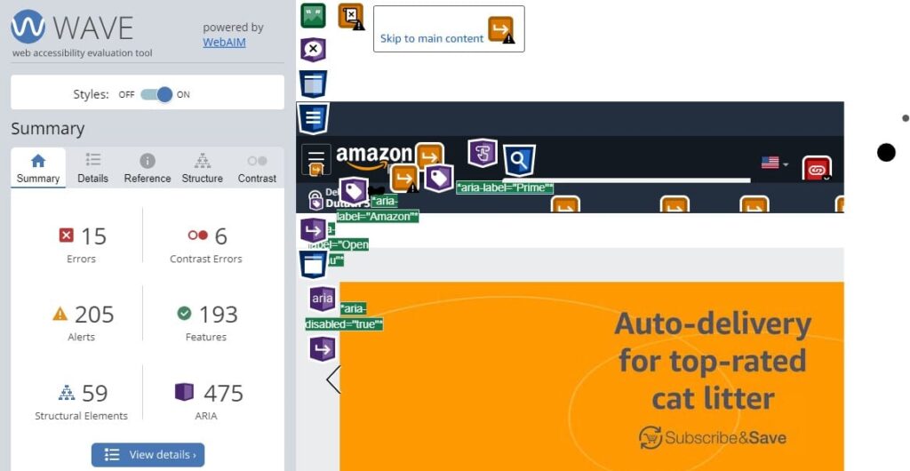
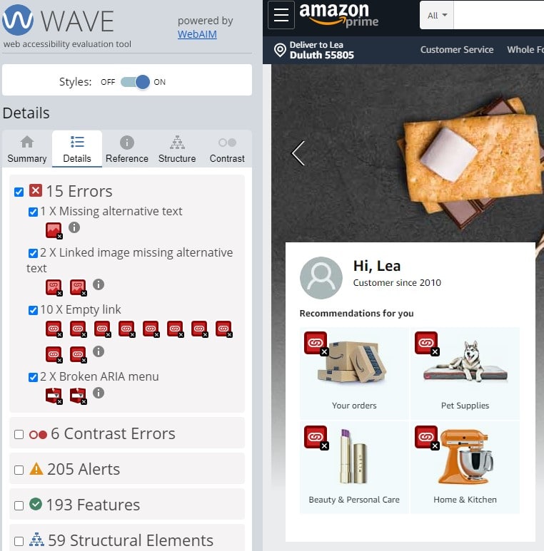
- Checking for text alternatives for images (included in the img tag markup as alt=”description of the image”) is done with a number of tools. We like using the WAVE extension for preliminary checks because it’s fast. The WAVE tool evaluates images on the current page for alt text and answers how many images are:
- Missing alternative text?
- Linked images are missing alt text?
- How many spacer images are missing alt text?
You will need to manually access each image alt text to ensure its quality or that the function of an image is described properly.
Empty links
Empty links like these image links below don’t contain text which makes them inaccessible for all users. Without alt text the function or purpose of the link isn’t told to the user which can cause confusion for keyboard, screen reader, and other assistive technology (A.T.) users.
Test for quality headings
Content should be organized into sections. Imagine this post as just a series of paragraphs – it’d be a nightmare to find specifically the information you’re looking for. Part of making a website compliant AND user-friendly is utilizing headers throughout your content. Much like sighted users, users of A.T. skip through headlines using the headline commands. A.T. users browse through headlines until they find the information they are looking for and prompt the tech to read on from there. You can check headings by using the WAVE tool extension or you can test directly at the WAVE website.
On the website, it’s two easy steps:
- Open WAVE Web Accessibility Evaluation Tool webpage and enter the web page address in the field.
- Select the [WAVE this page!] button or press enter.
The web page will show up in the browser with little icons on it. Anything that visually looks like a heading should have a heading icon (H1, H2, H3, etc.) before it. Sometimes the tool will note something as a headline when it isn’t. Many times when we see this, we find that a content creator used the headlines for design and not function. A quick reminder that any given webpage should only have one Headline 1(H1) – as you see in the Amazon page above – because it is the on-page title. You’ll also see the blue circles (H2 label) next to each H2. Think of page and section headings architecture like this:
Example Headline Layout
- Headline 1 (H1) On-Page Title: Testing your Website for ADA Compliance
- Headline 2 (h2): Test for quality text alternatives
- Headline 3 (h3): Empty links
- Headline 2 (h2) Test for quality headings
- Headline 3 (h3): Example Headline Layout
- Headline 4 (h4): If there was more to break down, it’d be here
- Headline 3 (h3): Example Headline Layout
- Headline 2 (h2): Checking structure
- Headline 2 (h2): Checking for moving, flashing, or blinking content
- Headline 2 (h2): Ensure control of audio
- Headline 2 (h2): Checking color contrast ratio, keyboard accessibility, and forms
- Headline 2 (h2): Test for quality text alternatives
Again, if you’re looking for a list of the pages that are missing Headline 1s and 2s a better bet would be to use a crawling tool. The crawlers can’t tell you if the headlines are correct for the page they appear on, but it can show you where they are missing.
Checking structure
Checking the structure of a site is one of the most daunting tasks. We have found that using developer tools/extensions in browsers is extremely helpful when auditing page templates. Some browsers and extensions provide the option to turn off images, disable CSS, etc. from web pages. We recommend doing this – stripping the site down to its bones to help you identify where images, headlines, etc. may be read out of order by assistive technology. We’ve discovered issues like navigation items appearing at the bottom of the page instead of at the top – where a user, any user, needs it. When looking at the page with all code elements loaded, it appears in the correct position at the top of the page. However, when a keyboard user tries to access the page, they are taken all the way through the page first and then encounter what should be the primary navigation options.
Here’s another example. Below we see the website TheBigUglyWebsite.com, and it is ugly. We also see the stripped down version of the site next to it. This is an example of where a person utilizing assistive technology like a screen reader would have problems navigating a site. The stripped down view shows the items out of order and the H1 or On-page title dead last at the bottom of the read order.

Checking for moving, flashing, or blinking content
Testing your moving, flashing, and blinking content is all about reducing the risk of seizure for your users. For instance creating content where the whole screen flashes could be hazardous to someone that has Epilepsy. Creating safe content is the responsibility of all creators, designers, and web developers. Rapid or red flashes and some spatial patterns need to be avoided. There are tools like the Photosensitive Epilepsy Analysis Tool (PEAT). It can help navigate the details and provide a valuable experience to all users.
Ensure control of audio
Audio also has to be distinguishable. Visiting a website or app that automatically plays music is frustrating and can hinder the use of screen readers and speech input devices. Audio that plays for 3 seconds or more should allow users to pause, stop, or lower the volume. Don’t forget some users with hearing disabilities need clear audio to understand the information and music playing under a person speaking may cause frustration. These users need to be able to turn off background audio if it is too loud.
Checking color contrast ratio, keyboard accessibility, and forms
You may be wondering, what about color contrast ratio, keyboard accessibility, and forms? We covered these items in our ADA Compliance Guide which is available to download below, and provides tips and tools to help you navigate these fundamentals of WCAG.
If you need help, contact us for a free consultation! Our experts are available for WCAG audits and to help you achieve compliance.


