If you still aren’t convinced you need to dive headlong into Instagram Story Ads, I don’t know what to tell you.
Well, actually I do, because I already did just that.
Great! Now you’re ready to take the plunge, but do you know how to? If you’re like many marketers, there maybe some underlying trepidation and nagging questions. Where are those little hidden splinters that snag the sweater and unravel all the best intentions with this awesome ad placement?
The #1 reason we see most Instagram Story Ads fail?
….*drumroll*
Creative! Story Ads require exquisite creative. Without something to grab attention, the results languish, the advertiser declares “Story Ads suck!” and they cast off Story Ads into the garden of broken hopes.
But, Instagram Story Ads ARE a big part of the future. They can’t be ignored, but they must be done right. Here we will reveal the top 3 things we see that cause Story Ads to fail creatively.
Thing #1: Running the same creative you would in a feed
This is partially Facebook’s fault. When you make an ad, it’ll automatically show it in all placements, and unless you deliberately use their tool to see how it renders in each spot, you won’t know that it looks…..well, crappy.
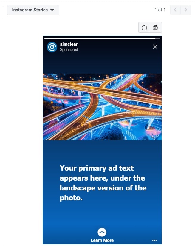
Let’s use an example. Here is a plain image ad that would look perfectly fine in the default view within Ads Manager. This is how it renders when it’s automatically reformatted for a Story Ad:
It doesn’t look terrible, but harken back to our previous post that shows Instagram Story Ads are a full-screen experience. The default image is small, and it’s sharing the real estate with text. It’s not really a standout, and based on the fact most Stories use full-screen, it becomes obvious this wasn’t a creative native to Stories.
How do we fix it?
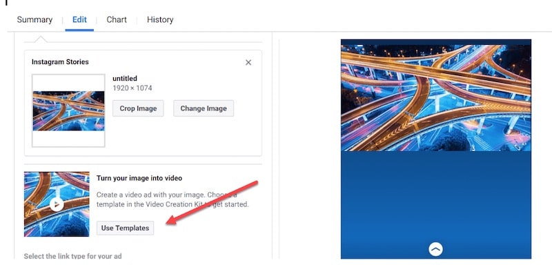
There are many tools in Ads Manager that can take this creative from zero to hero. Our favorite is to turn the image into a video.
This not only gives it motion to fit in better to the Story line-up that users scroll through, but it also lets us use the entire screen. A few simple edits, and this is what we get instead:
Which ad would YOU click on?
Thing #2: You’ve Got 15 Seconds–Make Them Count
Storytelling has been around since the dawn of mankind. The internet is changing the way we tell stories effectively. That’s even more true for paid social ads.
The classic story arc is three parts: beginning/intro, middle/the challenge, and the end/the conclusion. Books have followed that pattern for centuries, and later movies and TV shows followed suit.
Now try to do that classic story arc in an environment where you’re lucky to get 15 seconds of captive viewing.
Yikes, right?
Social storytelling is most effective when that traditional model is flipped to operate in reverse: show the outcome so users get curious about the background, not the other way around.
This reality is something that creative is still learning to grapple with. Just watch videos you see in your own feeds. Intros are WAY too long. Watch times are then non-existent, because users just don’t give a rip.
Story Ads give you 15 seconds to get it done, folks. You best make them count – particularly the first few seconds. Luckily, there are tools for this, too!
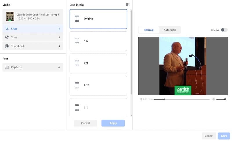
Make use of the video editing tools right within the Ads Interface:
Use cropping to get rid of anything that dilutes the main image you want to focus on. This is helpful for videos that were not shot close up – it puts YOU in the driver’s seat to help user eyes go where they should immediately.
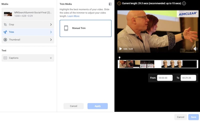
Use the trim tool to tighten things further. Lop off long intros, or endings that take too long:
No more long fade-ins that users scroll by. No more huge wind-ups. Drop them right into the action, and combine it with the aspect ratio in cropping to make it something irresistible to watch!
When you take the time to do this (and it doesn’t take a ton of time to begin with), the results will show. This is just one example of what happens when you take the time to treat Story Ads separately; the results improve, and you can start to scale.
Thing #3: Allowing Facebook to auto-allocate budget
As we’ve probably all seen by now, Facebook’s algorithm doesn’t always make the best decisions on budget allocation. While the algorithm sometimes gets it right, Instagram Stories is one placement that tends to get the least proportion of the budget, even when it’s the best performer.
Yes, it’s a more limited inventory space, but we’ve seen huge gains when we create a campaign specifically for Stories and put a budget against it. Even if we don’t get the results we want at first, we can easily test things that keep the effort separate from the feed, including adjusting targeting, bid testing, dayparting, and similar things.
The results? Let’s look at an example of a specific instance that packages up ALL THREE of the things we are talking about here. When we took on this particular account account, it:
- Did not have separate creative for Story Ads – it was auto-placing the feed ad.
- Because of that, it was 15 seconds of a static image. It didn’t maximize time, and it actually felt interruptive (in a bad way) of a user’s experiencing swiping through Stories.
- It was letting Facebook auto-allocate budget. This wasn’t bad in and of itself, because the Story Ads weren’t working. But it also meant there was virtually no data to allow us to determine how to improve it.
After doing all the things outlined above, with the final step being to put it into its own campaign and scale that sucker! Here’s what happened:
Scale AND a lower CPA AND superior results? BOOM! Dreams do come true!
The Format of the Future
As Instagram continues to grow into Facebook’s next ads darling, expect the ad offerings to evolve. Instagram skews younger and devotees of Stories themselves are an even younger subset within that group. We believe Story Ads are the first iteration of a new path in ad creative that will continue to erupt over the next few years.
And, it’s time. The feed has been there forever, and it’s become a little stale in how it was always used. We work tirelessly to find new and creative ways to make the feed sing, but eventually new formats are absolutely necessary. Like any evolution, what got you here won’t get you there.
Have you experimented with Story Ads yet? We would love to hear how it’s gone for you in the comments, or on social!
And here’s the next step: Learn how to use the new Instagram Story Ad templates to make implementing what you learned in this post even easier.

